You know those websites that look like they were made in 1999 — but intentionally so? The ones with oversized type, jarring colors, no gradients, no smooth shadows, and definitely no soft corners? Welcome to the world of neo-brutalism!
Table of Contents
- What is Neo-Brutalism?
- A Brief History
- Core Principles
- Why It's Trending
- Use Cases & When to Use It
- Notable Examples
- My Take on Neo-Brutalism
- Further Reading
What is Neo-Brutalism?
Neo-brutalism is a web-design trend that deliberately rejects sleek, overly polished aesthetics in favor of something raw and bold. It’s characterized by harsh contrast, unstyled HTML elements, mono or system fonts, visible borders, and layouts that feel like they weren’t designed — even though they very much were.
It's not about being ugly—it's actually quite the opposite. Most importantly, it's about being honest, functional and attention-grabbing. Think of it as the digital equivalent of brutalist architecture, but with <div>s instead of concrete slabs.
A Brief History
Brutalism started in architecture in the mid-20th century. It was raw, functional, and stripped of decorative fluff. In web design, brutalism first popped up in the early 2010s as a kind of countercultural reaction to overly polished, corporate websites.
Neo-brutalism is a more refined, digital-native version of that idea. It's still anti-fluff, but it often combines the raw aesthetic with intentional structure, UX considerations, and even some subtle elegance.
Core Principles
Here are a few pillars of neo-brutalist web design:
-
No gradients. No gloss. Everything is flat and honest.
-
Visible structure. Borders, grids, and containers are on full display. Rounded corners are a definite no-go.
-
Harsh contrast. This is often achieved by pure black on white, or clashing neon palettes without any blend or gradient.
-
System fonts. No Google Fonts bloat — just good old
Arial,Courier, orTimes, although this is not a strong requirement. -
Minimal interactivity. Links look like links. Buttons look like buttons. No mystery meat UI with tons of animations.
-
Bold typography. Big text, raw headings, sometimes with no kerning mercy.
Why It's Trending
Because design fatigue is real.
After a decade of gradients, neumorphism, smooth animations, and "everything looks the same" websites, neo-brutalism feels refreshing. It's bold. It's weird. It says "a real human made this."
It also resonates with younger audiences — especially designers, devs, and creatives — who want to stand out, challenge norms, or just have fun building something that doesn't look like a startup landing page template. And frankly, it's hard not to recognize the appeal of a design trend that flips the bird to what is commonly considered appropriate.
Use Cases & When to Use It
Neo-brutalism isn’t for every project. You probably don’t want your banking app to look like this website.
But it's great for:
-
Personal portfolios
-
Art or design blogs
-
Fashion showcases
-
Landing pages that want to make a strong first impression
-
Brands that want to show a bit of edge, attitude, or nostalgia
Use it when you want to provoke a reaction — not blend in.
Notable Examples
Some standout examples of neo-brutalism on the web:
-
WORKWITHUS — a neo-brutalist take on a job board with a lot of creative positions
-
Demo2023 — a promotional website for a design event held in NYC
-
BRUTAL WEB — a full archive of brutalist and neo-brutalist websites
-
ctrl+alt+reset — obviously 😉
 Image Credit: Yuliya Shlyk on Dribbble
These sites often break the rules, yet feel cohesive. They’re not broken — just brutally intentional.
My Take on Neo-Brutalism
And now for the part that surely everyone has been waiting for — my opinion about neo-brutalism.
Personally, I find it very liberating. There's something refreshing about ignoring conventional design "best practices" and leaning into the rawness of the web. It reminds me of the early internet — the weird, scrappy, personal one.
It also forces you to think differently about design. When you're not relying on animations or gloss, you're left with layout, content, and personality. And sometimes that's more than enough.
Further Reading
If you’re interested in diving deeper into neo-brutalism, check out these great reads:
- A deep dive into brutalism – Webflow Blog
- What is the difference between Brutalism and Neubrutalism in UI Design? – CC Creative
- Brutalist Websites – Showcase Gallery
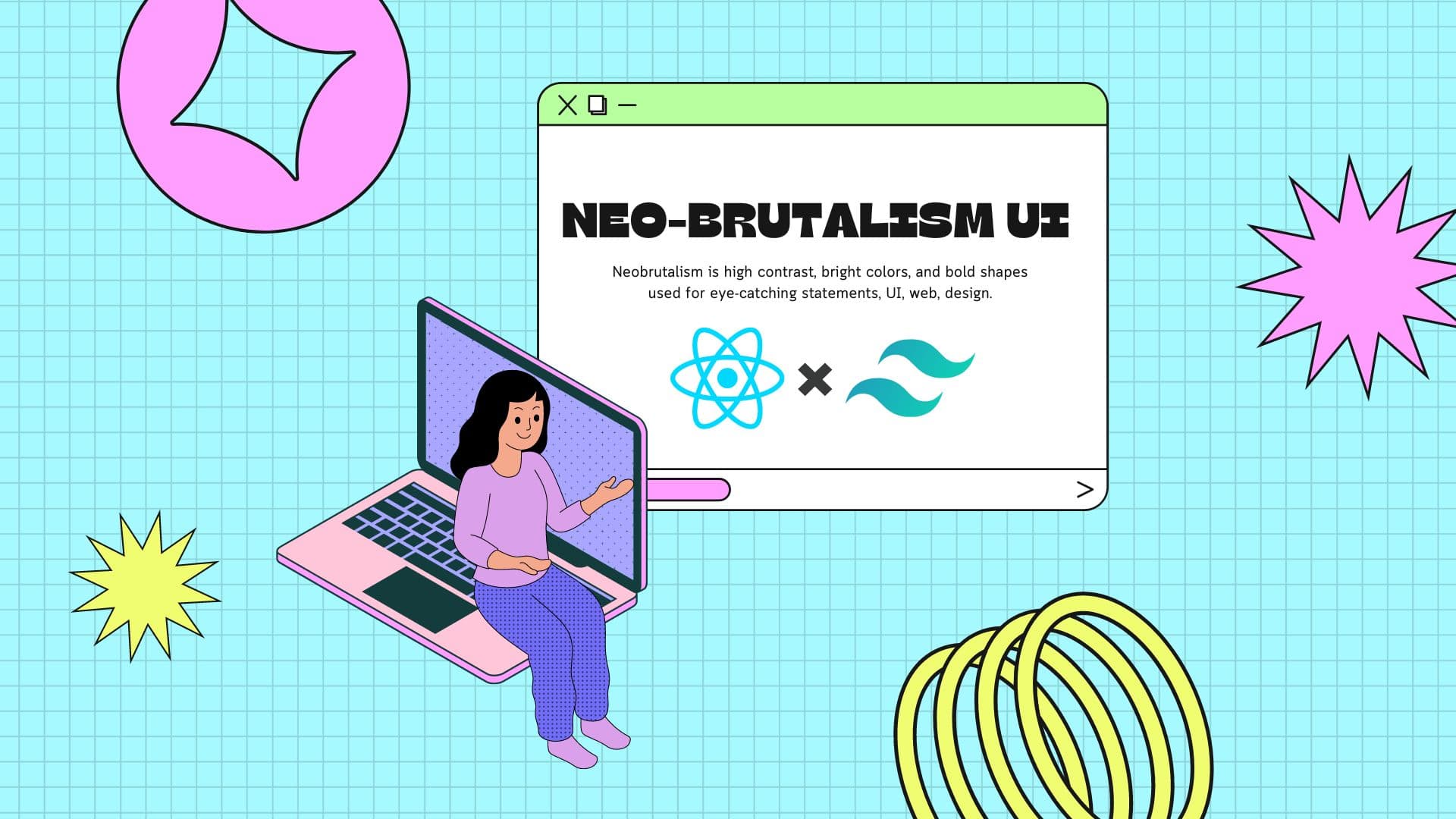
Want to see how to implement a neo-brutalist UI in your own website? In one of my next posts I will go in-depth on how to achieve that utilizing powerful utility classes from Tailwind CSS.
Stay tuned!